
BIGG
Design and product partners since 2018: the sites, the member app, the brand tools and the strategy behind them.
Fitness · 2026 · App, Website, Brand
bigg.fit ↗
BIGG
Design and product partners since 2018: the sites, the member app, the brand tools and the strategy behind them.
Fitness · 2026 · App, Website, Brand
bigg.fit ↗The problem
One brand, two websites, many accents.
We're BIGG's partners in design and user experience, and we've been since 2018 — a partnership, not a project. Alongside that, we build products for the business itself: internal tools to run the brand and the app the member opens every day. We've grown with BIGG as it opened studios across nine countries, and each new stage — new markets, the app, the new websites — we've built and launched together.
BIGG talks to members on two continents: a global site, a site of its own for Spain, pages in Portuguese and English for Portugal, and an app. Each had grown on its own, so the same brand sounded different depending on where you landed — Argentine voseo on one side, peninsular Spanish on the other.
The story needed to change too. HIIT is only one of the stimuli in the method, so the sites had to explain what a BIGG class actually is, and bring back the goal selector — the most distinctive part of the product — to the home page.
The approach
Start from the method, not the page.
Before designing anything, we distilled BIGG's product, brand, sales and training material into one knowledge base shared by both websites: how a class is built, the stimuli, the catalogue of goals and the member's journey. One rule came straight from it — members never hear about their plan, only about their goal.
We mapped the full customer journey in seven stages, from seeing an ad to bringing friends, and tied every app screen, web page and lifecycle campaign to the stage it serves. Out of that came the idea that organises everything else: group training, individual goal.

Visual system
Light first, with black as accent.
We turned the sites light-first: bright backgrounds by default, with black kept for the hero, the navigation, the footer and calls to action. The fluorescent green became a texture for type and accents, never a background, and the pastel green carries the main buttons.
Each typeface got one job: an ultra-condensed display face for large titles, a wide face for headings and every number, and a sans for reading. The brand's dot pattern was rebuilt as a mask, so its colour stays a design token wherever it appears.

The app
Your day, in four blocks.
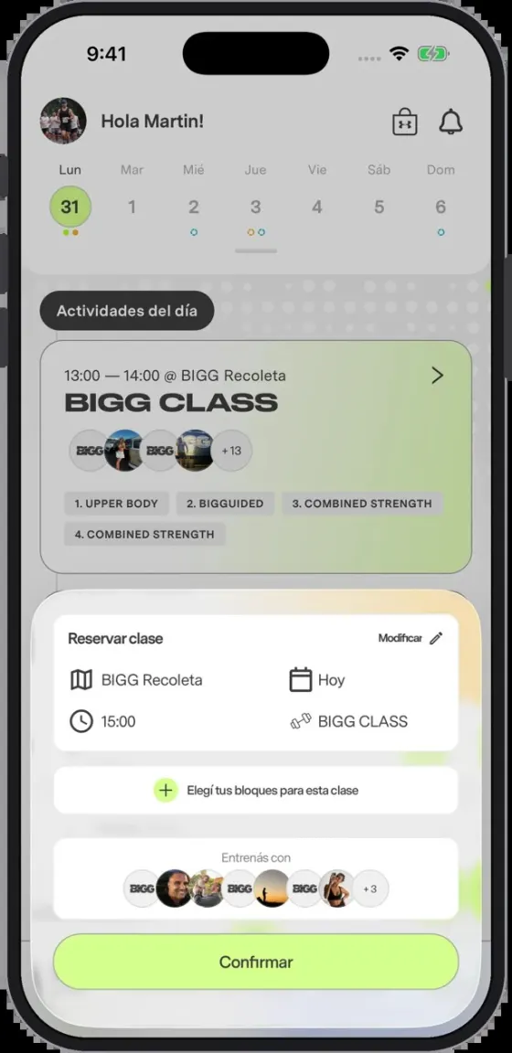
We launched the app's new home around one daily timeline, "Your BIGG day", where every day of the week uses the same module. At its centre, the day's workout appears as four compact blocks. Booking a class only changes what the card says: class, time, studio and who else is going.
The workout follows the member. At a BIGG studio, the main action is booking the class; at home, the blocks adapt to the space, are marked as changed for that location, and the action becomes starting the workout. On Sundays it suggests training outdoors, with the weather inside the card.

Web and landings
One landing for every studio and angle.
Paid traffic lands on a single page that takes its instructions from the link: which studio to pre-select, which campaign angle to tell — padel, hybrid racing, back to routine — and whether to show the form, WhatsApp or the navigation. Without them it stays exactly as before, and the copy lives in one source that feeds both sites.
Around it, we launched every studio page on the new system, studios are grouped by area from their coordinates, and new pages explain the training and the goals. A "Build your plan" panel asks the same questions as the app's onboarding, so every enquiry arrives with its goal.
Strategy
From the first ad to the member's first class.
Design is only half of what we do for BIGG. We also plan how the brand grows: which pages serve which studio and which audience, what gets published and when, and how each enquiry is followed from the first click to the day someone becomes a member.
That means lead tracking end to end, from the ad or the search to the sign-up, so every channel can be judged by the members it brings. It means a landing for every studio and franchise, a search and editorial plan with a calendar that keeps the blog alive, and a redesign of the sites led by the same questions: who lands here, what do they need to decide, and what is the next step.