
GMARQ
A name drawn in cut letters, and offices shown as they are lived in.
Architecture · 2024 · Brand, Website
marrone-arq.com ↗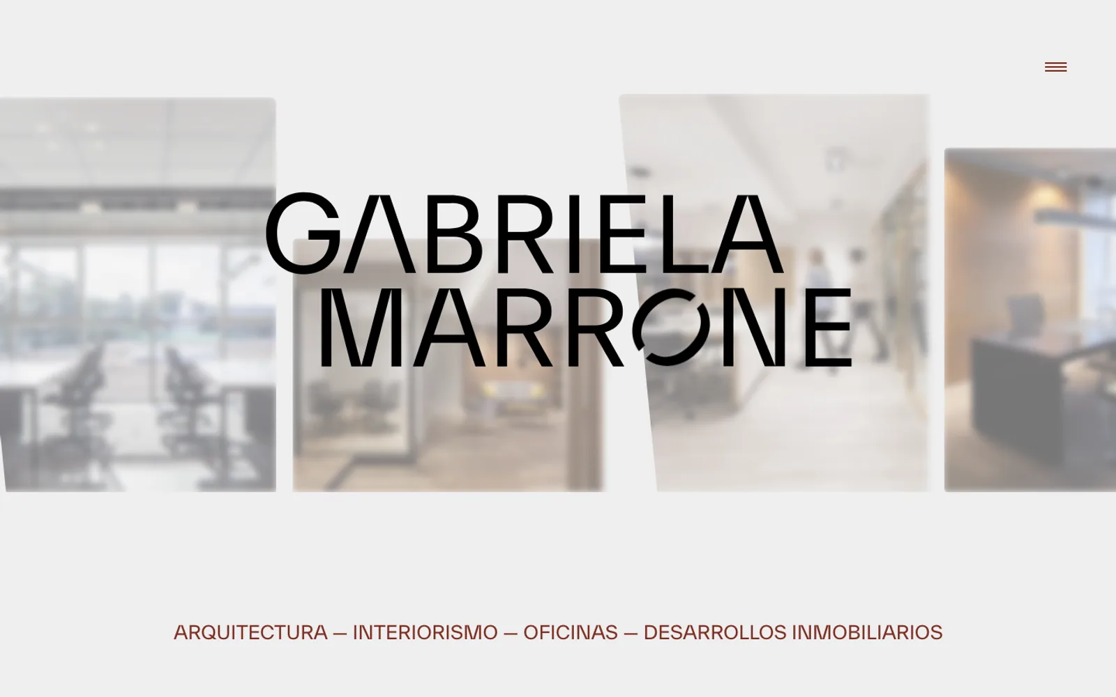
GMARQ
A name drawn in cut letters, and offices shown as they are lived in.
Architecture · 2024 · Brand, Website
marrone-arq.com ↗The starting point
An architect who designs offices for the future of work.
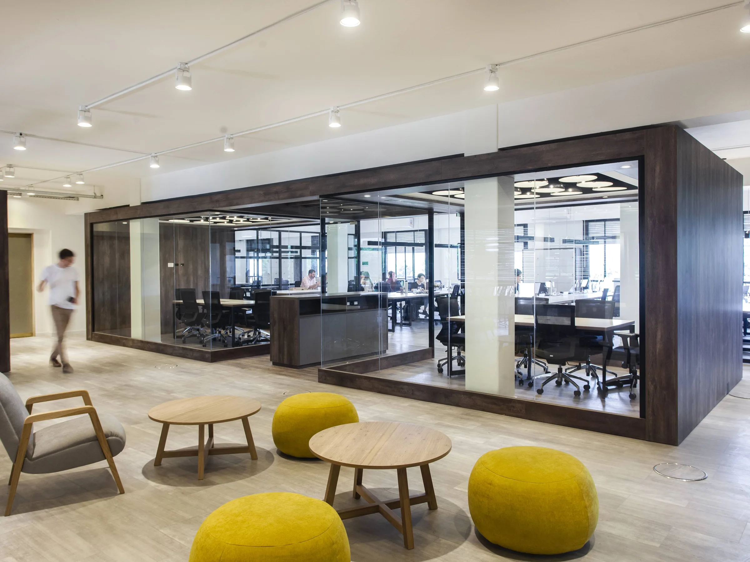
Gabriela Marrone is a Buenos Aires architect with more than 25 years of practice in architecture, interiors, offices and real-estate developments. Her studio designs workplaces that promote wellbeing, motivation and productivity — spaces for Mercado Libre, Fundar, Atanor and Vexina, among others — and every project starts by listening to the client before drawing a line.
She came to us with a body of work and no identity of her own. The job was two things at once: a brand that carries her name, and a site that shows each office the way the people who use it see it.
The identity
Her name, with the letters cut.
The brand is a wordmark: GABRIELA MARRONE in two lines of capitals. A few letters are cut open — the A loses its crossbar and the O is split by a diagonal — the way a section drawing cuts through a building.
It works at any size, from the small mark in the menu to the full-width title on the home. It was drawn in ink black, with a blue version and a white one for dark grounds, so the studio can put it on a plan, a render or a door.
The approach
The name first, then the work.
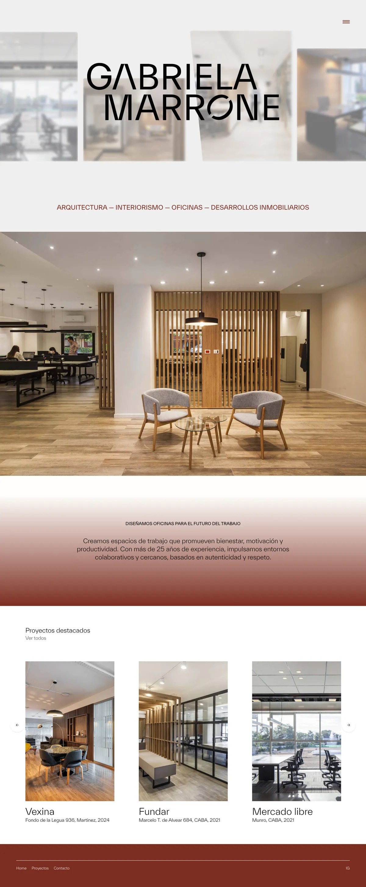
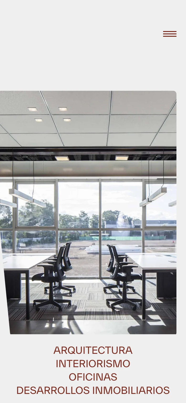
The home opens on the wordmark over soft, out-of-focus photographs of her offices, with one line underneath: architecture, interiors, offices, real-estate developments. Below it, a full-width photograph and the featured projects in a carousel.
From there the site stays out of the way. A short statement about designing offices for the future of work, a counter of her 23 projects, and a menu with three entries: Home, Projects, Contact.
Visual system
Paper white, one oxblood, a neutral grotesque.
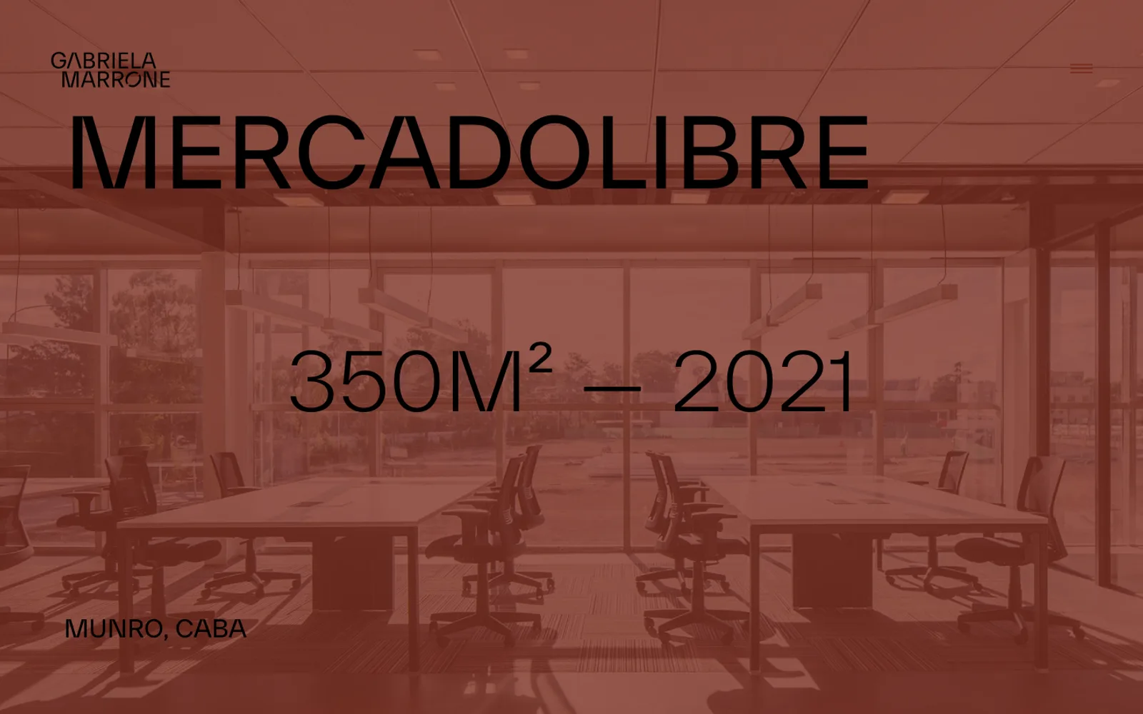
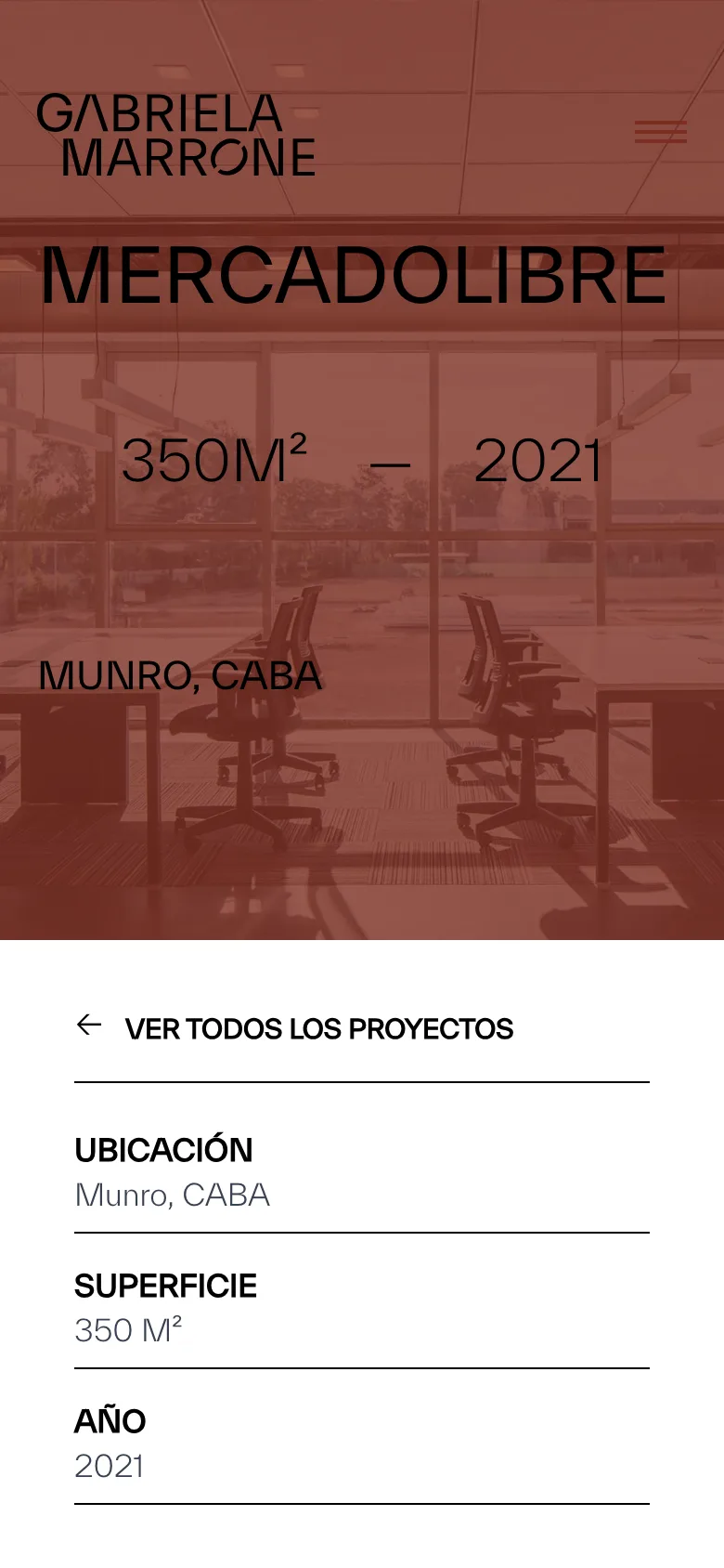
The site is a light grey paper with black type and a single colour: oxblood, from the palette of timber, leather and brick in her own work. It colours the tagline, the footer and the project covers, where each photograph is tinted so the name and the numbers read at a glance.
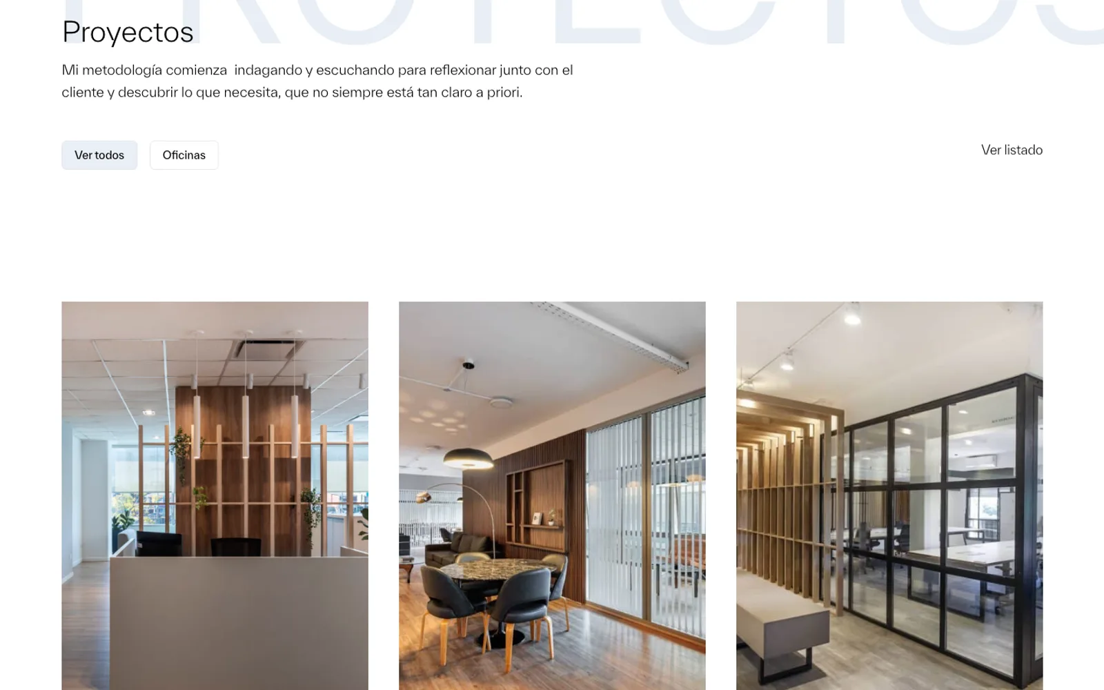
The type is a neutral grotesque in light and regular weights, from the huge PROYECTOS behind the listing to the small data sheets. Photographs are never cropped into decoration: they run in full-width pairs and singles, as in the offices themselves.
The projects
Every office, as a grid or a list.
The projects page opens with her method — listening first, to find what the client needs even when it isn't clear at the start — and then the work. It reads as a grid of covers or as a list with the address, the floor area and the year, and it filters by type.
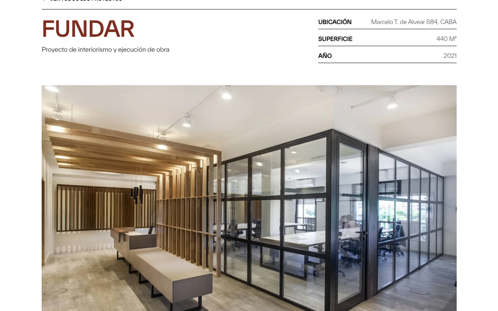
Each project has its own page: the cover in oxblood with the name, the area and the year, a short data sheet with the location, the surface and the services provided, and a gallery that alternates full-width photographs with pairs. A contact form from the menu closes the loop.